Proposal for Virtual Thermostat user interface design
Hi!
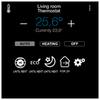
This is just a proposal for redesigning the current VT interface. Specially thought for Zipatile, but also could be applied for web and mobile UI.
Idea is to do it clearer but with more functionalities. For sure there are more options, so if anyone would like to add anything, it would be great.
Here it is:


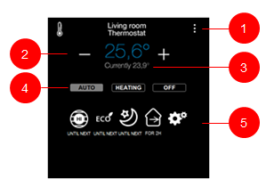
Room or name of the VT (line 1)
- If you click on the dots of the right apart from current options program schedule is shown and can be changed if neccessary
Setpoint (line 2):
- is marked blue if cooling is activated
- is marked red if heating is activated
- is grey if nor cooling nor heating is activated
+/- buttons for setpoint (line 2):
- They allow manual modification of the setpoint
- If they are used, “Auto” is de-activated and “heating” or “cooling is activated” (see bellow)
Current temperature (line 3):
- Current temperature, please only one decimal
Auto, Heating, Cooling and Off buttons (line 4):
- Selected option is marked with other color or background
- Auto means current “Program”
- Heating/Cooling:
- If no cooling or no heating output devices are configured for the VT, button is not shown (simplification of the UI)
- If you select Heating or Cooling instead of Auto, this means manual operation (see line 5)
Line 5: the content of this line depends on the above selection. Selected option is marked with different color or background. This line could work as follows:
- If Auto is selected and is purely “Program”, nothing on line 5 is marked as selected.
- These could be available options on line 5 (if something is selected, should be marked with different color or background):
- 4 pre-configured options:
- Comfort until next period
- Eco until next period
- Night until next period
- Away until next period
- 1 button to customize previous 4 options:
* A pop-up window opens and you can choose what to show on those 4 options on the main screen. Combinations available:
* Confort, Eco, Night, Away – any of them together with – Until next, Until time, During, Permanent. I am showing some sample icons depending on the combination. Idea would be to create self-explaining icons
- If Heating or Cooling is selected (or +/- buttons used) this means manual operation. Available options on line 5:
- Until next
- Until time
- During
- If Until next, Until time or During options are used, afterwards it should jump to... OFF? Auto? This is to be decided
- Permanent
- If OFF is selected, available options on line 5:
- Until next
- Until time
- During
- If Until next, Until time or During options are used, afterwards it should jump to Auto? This is to be decided
- Permanent
Additionally to all this, it could be created a multiroom VT view (maybe PRO feature), where you could see all the current and set up temperatures, and by clicking on them you go to that VT.
Hope at least some of the features are heard by Zipato!
Pablo


 I like this idea
Nice one Pablo
Nice one Pablo
Replies have been locked on this page!