This object is in archive!
Suggestion - Combine synchronize buttons in the UI
Answered
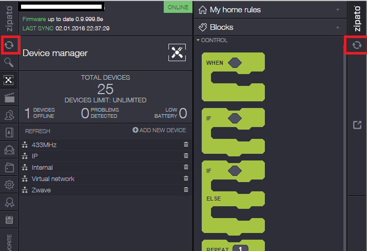
It's confusing with to synchronize buttons in the user interface. Does these synchronize buttons have different functions? If so - this was probably the cause of many hours of frustration when I started using this system.

When holding over the buttons, one says "Synchronize" and the other "Synchronize rules".
My idea is to do one of these implementations:
1. Remove one of the synchronize buttons (meaning, combine the functionality).
2. Make sure the graphical elements of the buttons are different, making it understandable that these buttons are NOT the same.
No connection
Real-time notifications may not work


 The same question
I have no idea why this hasn't been suggested before. Yes they should both do the same thing, sync everything. No more confusion.
I have no idea why this hasn't been suggested before. Yes they should both do the same thing, sync everything. No more confusion.
I totally agree.
Im new to Zipato and found myself with having rules not working, before finding out that the two sync buttons dont work the same.....dooohhh
I totally agree.
Im new to Zipato and found myself with having rules not working, before finding out that the two sync buttons dont work the same.....dooohhh
Hello,
"Synchronizing buttons' functions" must be same (Or only 1 button can be enough).
We are a home user. We do not work on the software everyday like you.
I lost a few hours, Finally, I understood that the problem is only to push the other "Synchronize button"... ?!
Hello,
"Synchronizing buttons' functions" must be same (Or only 1 button can be enough).
We are a home user. We do not work on the software everyday like you.
I lost a few hours, Finally, I understood that the problem is only to push the other "Synchronize button"... ?!
Hi
left sync button synchronizes devices, settings, scenes, rooms (i.e. all features from the left side of dashboard) but not rules and the right sync button
  synchronizes ALL (right sync button plus rules).
Hi
left sync button synchronizes devices, settings, scenes, rooms (i.e. all features from the left side of dashboard) but not rules and the right sync button
  synchronizes ALL (right sync button plus rules).
Replies have been locked on this page!