

Android App on wrong track, will affect iOS app?
https://plus.google.com/communities/107959331935751006364
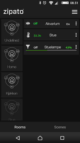
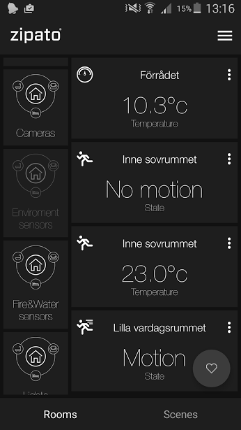
What interface do you guys like? The first picture or the second?
The first is my example of smal elements.(clear overview) My ide is that if you "press and hold" you can dim the lights but the programer disregarded my ide, and others requests and used this for rearranging of elements instead, witch make it impossible to use for dimming lights, blinds. When Zipato down't listen during beta stages we will get a app that in fact are worse then we have now.
This is how the programer say that Zipato wants it to look! What do you think is this convenient?
Do you rely want this size of the elements. If anyone agree with me pleas speak now, otherwise the next version of the app will look like the image below.
I have tried to push for "press and hold" when dimming lights(https://www.youtube.com/watch?v=7tRJgAE7s8I). But the programer instead used this as rearranging of elements, I reminded him that you want to look the interface so your kids, girlfriend, mother in law, don't rearrange the elements. He answered "then don't let the kids use it"
I emaild Zipato to know if they really wanted this interface or if it was the programers ides. "Witch I still think it is"
Email respond:
"However, we have various users and many elderly people among them. This is the initial and universal version, we gonna publish some additional skins in the future, which will be more in the direction which you are talking about."
IMO this could take years. When you search the forum you can find out that this ides is not new, other users have told them something similar.
I have tried to push for smaller elements and, several at the android forum wants this. But now Zipato tells that there are meny elders that use Zipato and wants this interface. I don't believe that, Sebastian is not that old;-).
My thoughts is:
1) Keep interface as it is, and add features. Or...
2) Or use the new interface but listen to the customers. Smaller elements.
3) Keep the old dimmer interface and add press and hold feature. like volume on Muze app: (https://www.youtube.com/watch?v=7tRJgAE7s8I).
4) Possibility to lock the interface so you don't buy mistake rearrange the elements.
5) Have 3 menus at the botom "DIVICES", "ROOMS", "SCENSE" (Every one is satisfied)
6) Have your own "Favorite" screen as option in the front. The app starts with your favorites.
The dimmer interface is absolutely worse than it was in the old interface.
If you don't like this new interface pleas speak now before it is to late, even if you are elder;-) !
 I like this idea
Replies have been locked on this page!