

This object is in archive!
Overlapping text in UI
Known
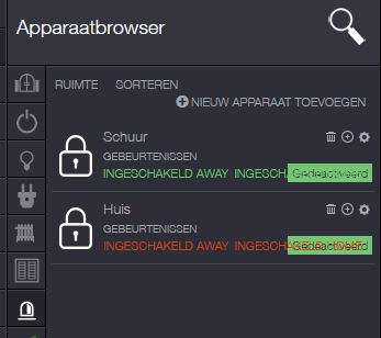
As you can see in the attachment there is some overlapping text by the alarm option. In Dutch (and maybe other languages?) this text needs more space...
It would be nice if this will be fixed sometime.
Files:
alarm.JPG
 The same problem
You can't vote. Please authorize!
No connection
Real-time notifications may not work
It needs to be optimized by the person who did the translation so it will fit. I deliberately made the slovak language to fit the space.
Please open a ticket with support and provide a shorter text for all statuses. These are:
As you can see these english versions perfectly match the lenght requirements, so try to be as close as possible (shorter does not matter, only longer matters).
It seems there is a line break between the to options in german translation.
It seems there is a line break between the to options in german translation.
Replies have been locked on this page!